5 Directors Who Mastered The Psychology Of Color In Film
By Erin Whitten
Filmmaking is a visual language, and color is one of its most vital tools. The best directors don’t use it just for aesthetics only, and this list will prove it. They use it for psychology, building emotional responses to characters, moments, and entire worlds. Whether with bright palettes that are hard to look away from, or subtle shifts working on us at a barely conscious level, color is storytelling at its most invisible and its most unforgettable. These are some of the legendary directors who turned color into their signature storytelling tool.
Tim Burton
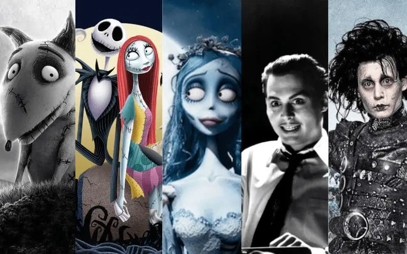
Burton’s style is recognizably gothic, in that shadow and color are almost go hand in hand with each other. He frequently lifts from German Expressionism with its distorted lines, extreme contrasts and dreamlike worlds that are often more disturbing than they are real, but often offsets the grotesque with eruptions of eccentric. Edward Scissorhands, for example, features banks of pastel-colored suburban houses in visual opposition to Edward’s gothic, shadowy home, externalizing his alienation against the bland, two-dimensional joy of suburbia. In The Corpse Bride, by contrast, Burton exceeds audience expectations by rendering the world of the living in a muted color palette while the land of the dead is bright with unnatural greens and spooky blues, making the dead seem more alive than the living. Throughout his films, black and white have come to connote mourning and strangeness, while pinks and pastels, as well as warmer colors, indicate innocence, safety, or naiveté. It truly is the contrast between his gothic darkness and childlike palette that has become “Burtonesque”, rendering his work simultaneously spooky, whimsical, and immediately identifiable.
Wes Anderson
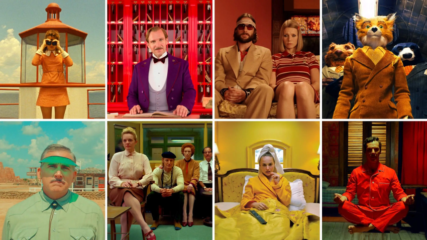
Wes Anderson films are immediately recognizable by his style – so much that it started a TikTok trend earlier this year. Pastels, primaries and stark contrast are his visual signatures, and they don’t just serve as aesthetic choices, but subplots to his scripts. The warm tones of Moonrise Kingdom are evocative of nostalgia and childhood while the bright pinks of The Grand Budapest Hotel turn the screen into a fantastical fairytale. Even in animated works like Fantastic Mr. Fox, Anderson uses a more muted warm palette and deeper oranges, browns and reds to create a more cozy, earthy, vintage look. Every single frame in his films are carefully curated so that the color itself sets the mood before anything is said or done. There’s a quality to his use of color that is so consistent and codified that certain shades become shorthand throughout all his films. Red for passion and heartbreak, yellow for youth and innocence, and dull blues and grays for melancholy and pensiveness. In Anderson’s work, color takes on a life of its own as a full character in the film, and they get better with each film.
Stanley Kubrick
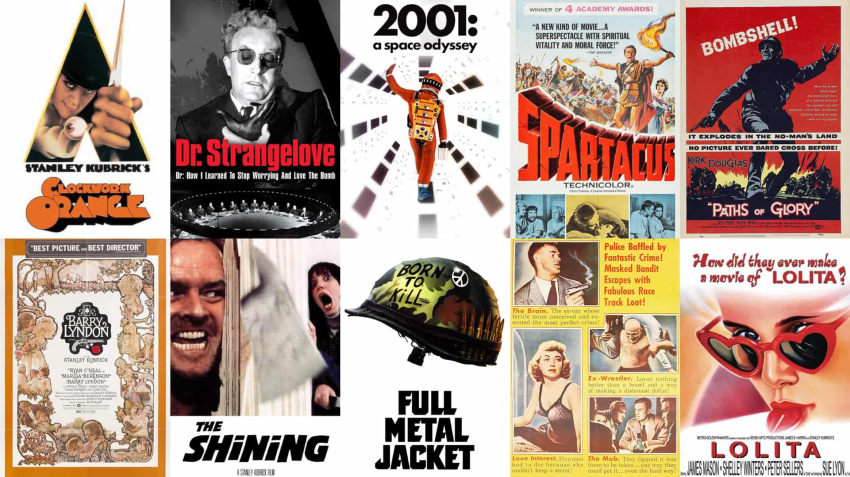
Stanley Kubrick’s movies are as much about his use of color as they are about his incredible scripts. While some directors use color to embellish a scene, Kubrick used color to unsettle an audience. Think of the deep reds and sour yellows of The Overlook Hotel in The Shining which make the space itself feel foreboding and dangerous, even before any blood is spilled. Then there is the cold whites and interminable blues of space in 2001: A Space Odyssey which give the entire universe an impersonal, almost clinical beauty until the sickly red of HAL’s eye pierces the screen (this is a prime example of the subconscious power of Kubrick’s use of color, the eye is a simple thing, but somehow it’s one of the most iconic and threatening images in all of film). Kubrick always selected these harsh colors for his films, because he used colors as psychological triggers for those watching. The use of color in Kubrick’s films is different though, because its impact on people watching emerges before they consciously realize it!
Wong Kar-wai
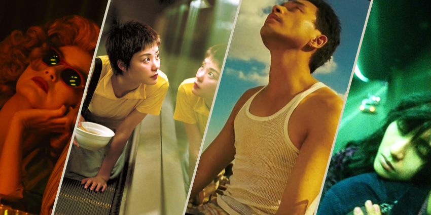
Hong Kong cinema has given the world many great directors, but few are more instantly recognizable or uniquely personal than Wong Kar-wai. Born in Shanghai, Wong grew up in British-ruled Hong Kong, separated from his siblings during the Cultural Revolution and with cinema as his primary form of escape. The yearning and sense of displacement he experienced in those formative years stayed with him throughout his work. After getting his start as a television writer during the Hong Kong New Wave, Wong quickly found a voice and style of his own. His color palettes, music, and editing are were always in the service of emotion, and clearly picked carefully. Days of Being Wild uses faded greens and yellows to create the ambiance of lost youthful love while In the Mood for Love uses deep reds and glowing amber to create spaces full of restraint and desire in which characters are trapped. Wong’s films are often described as romantic, but at their center they are about time, and the way that missed opportunities and unspoken feelings haunt us long after they’re gone.
Nicolas Winding Refn

Nicolas Winding Refn’s films look the way they do not only by emotive design, but by necessity as well. The colorblind director can’t see midtones, which leads him to emphasize everything in neon brightness or deep shadow. His upbringing in Copenhagen and New York around movie and TV sets led him to develop an eye for cinema that first emerged through the Pusher trilogy and has remained a constant throughout his work. In Drive this led to Los Angeles glimmering with a strange sort of glow, with warm golds and greens turning the basic crime story into something heightened and almost dreamlike. In The Neon Demon, his use of color had become even more aggressive, with icy blues, piercing reds and searing pinks popping up in almost every frame to make the fashion world he’s portraying feel glamorous and unthinkably hostile at once.