3 Branding Flops That Prove Media’s Identity Crisis Is Real
There’s a new tradition in the media industry, whenever a platform becomes wildly successful the solution is never “make better shows” or “lower the price for subscribers.”
By Erin Whitten
There’s a new tradition in the media industry, whenever a platform becomes wildly successful the solution is never “make better shows” or “lower the price for subscribers.”
No, the solution is always change the name. Executives huddle in a glass tower, hire a branding agency to create a deck full of mood boards and buzzwords, and decide what audiences “really” want is another round of app downloads and new acronyms to memorize. For users, it’s tiring. For culture? It’s a loss. In the 2020s alone, there’s been too many fumbles to count, but these three in particular take the cake.
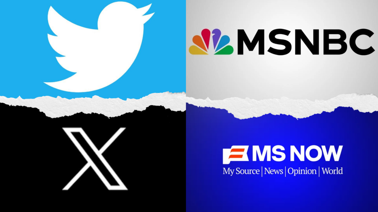
Twitter (2006-2023) → X (2023-Present Day)

Twitter had been messy from the start, but it had been iconic. It had established a cultural identity of a bizarre town square where presidents and comedians and teenagers all screamed into the same void. “Tweet” had become a verb, the bird had become a symbol, and even people who loathed Twitter had a sense of what it was.
Then comes Elon Musk, who looked at all that cultural equity and thought “what if I just name it after my favorite letter?” Suddenly the bird was gone, the word “tweet” was dead, and the platform was just… X. A name so uninspired it could be anything. Is it an experimental drug, a sci-fi villain? Both? Features that had defined Twitter…verification, visibility, even basic reach, were packed into “Premium” tiers. The blue check, once a marker of legitimacy, was now a subscription sticker you could buy for eight bucks. Suddenly trolls, impersonators, and brand parodies were verified right alongside journalists and public figures. (The fake Eli Lilly “insulin is free” debacle alone wiped out billions in stock value.) Musk even tied visibility in replies to payment, so if you don’t subscribe your voice is demoted to the bottom of the feed.
For users, this was an acknowledgment that we don’t own the platforms we build culture on, but they are owned by billionaires who can vaporize decades of shared language overnight and start charging us rent for features that used to be free. For creatives who built careers writing, joking, and connecting on Twitter, the rebrand felt like vandalism. You don’t just erase a dictionary entry of culture and then put a paywall on top of it because one man wants to do jumping jacks promoting his brand.
HBO Max (2020-2023) → Max (2023-2025) → HBO Max (2025-Present Day)
HBO Max was supposed to be the crown jewel of streaming. “HBO” meant quality, prestige TV that defined the medium. Then Warner Bros. Discovery decided prestige was a problem. In 2023, they cut “HBO” from the name, slapped on the bland Max, and congratulated themselves for “broadening the brand.” Translation. They took one of the strongest names in television and replaced it with something that could easily be a protein bar.
Not to mention, the app launched buggy, crashing for users on DAY ONE. Entire libraries were shuffled, with kids’ content and beloved animated classics like those from Boomerang buried or axed entirely to cut costs. Features were quietly stripped away as it rolled out, ad-free subscribers lost 4K and multiple streams unless they upgraded to a pricier “Ultimate” tier. Instead of simplifying, the rebrand made everything more confusing: people didn’t know if they were signing up for HBO, Max, Discovery+, or some Frankenstein’s monster of all three. Viewers noticed with nearly 2 million people who canceled in the first quarter after the switch, leaving analysts scratching their heads at how executives could fumble a brand so badly.
By 2025, the inevitable happened and Warner Bros. Discovery admitted defeat and slapped the HBO name back on. Two years of chaos, millions of dollars wasted, creators sidelined, subscribers annoyed, and for what? The biggest flaw wasn’t the clunky app, or the tier shuffle, or the disappearing cartoons. The biggest flaw was believing that one of TV’s most trusted brands needed fixing at all.
MSNBC (1996-2025) → MS NOW (2025 – Present Day)
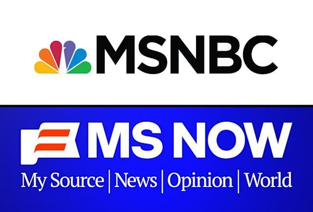
MSNBC was never perfect, but it had an identity. For decades, it was the liberal counterweight in cable news. It was the place where Keith Olbermann ranted, Rachel Maddow explained, and Donald Trump fumed about “fake news.” It carried the NBC name, backed by nearly a century of broadcast history, and it wore the rainbow Peacock with pride. Then in 2025, executives decided it needed to be “fresh” and “independent.” The result? MS NOW (My Source News Opinion World), a name so clunky it sounds like a parody Jack Donaghy would pitch on 30 Rock before sending Kenneth out with a petition. In the process, they tossed aside the Rainbow Peacock, one of television’s most enduring icons.
This is part of a broader NBCUniversal drift. Ever since Comcast took over, the company has been quietly neutering the Peacock, flattening the brand into sterile minimalism. Doing this to MSNBC , a channel that actually had cultural weight goes further. It feels less like modernization and more like memory-holing. The rebrand is brand new, so it’s unclear what changes are in store. I will say though, the early impression is ugly.