This New Instagram Update Will Ruin Your Entire Aesthetic (And Probably Your Life)

If the Internet hasn’t completely destroyed your life already, just you wait — Instagram’s new update is the latest assault on my social media personality, and I am shaking.
If you’re the kind of person who actually spends time working on your online aesthetic (and if you’re not, what’s wrong with you????), you’ve just spent hours picking the perfect photo in vain. That’s right, you heard me. All your hard work has proven to be, as usual, futile.
That’s because Instagram has decided to change up its format again, and this time it’s not something like Instagram stories or being able to “like” comments. No, this time it’s going straight to your account and changing up the look completely — instead of a grid of three columns, there will now be four.
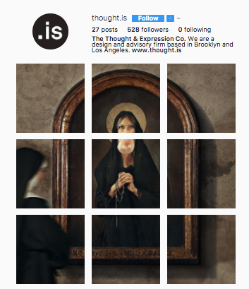
Okay, I’m sure some of you honestly dgaf. I mean, who cares, right? WRONG. Because some people, like social media influencers and people working to create a brand, have spent a painstaking amount of time working to set up their page a certain way, and now it’s ruined. You can say goodbye to masterpieces like this:

Thanks, Instagram.
The four picture grid hasn’t officially rolled out yet, but Instagram has been testing it with several users, apparently. If they go through with this, they’ll definitely receive some backlash, but let’s be real — is there ever not backlash when a social media app decides to update its features? Give us a year and we’ll all be back on track with our Insta aesthetic. ![]()


